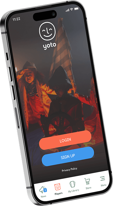
Yoto is a physical player for kids

Yoto is a physical player for kids

The Yoto Player is a screen-free smart speaker designed for children aged 3 to 12+ that uses physical cards to play audiobooks, music, podcasts, and activities

The Yoto Player is a screen-free smart speaker designed for children aged 3 to 12+ that uses physical cards to play audiobooks, music, podcasts, and activities

My Role

My Role

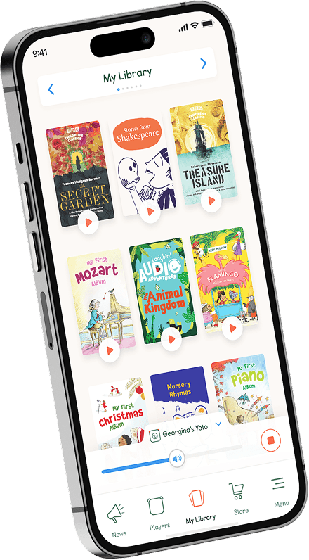
I joined Yoto in September 2019 as a sole senior product designer to help them design their native mobile companion app that helps Yoto Player owners to:

  • Set up Yoto player

  • Play and purchase content

  • Adjust Yoto Player settings

  • Create your own content

  • Subscribe for Yoto Club (monthly content delivery)


Taking complete ownership of the digital experience from day one, I set up a user-centered design process to turn raw concepts into a polished, market-ready app.

I owned the entire product lifecycle from end to end, which included:

Collaboration: I collaborated with our chief product owner (Co-founder) and other stakeholders to discuss feature set and initial ideas.
Research & Ideation: Gathered user insights to map out intuitive features.
Wireframing & Prototyping: Building fast concepts to define the app’s structure.
Testing: Validating flows with real parents to refine the user experience.
UI & Delivery: Crafting the final visual design and managing the engineering handoff.

Through these, I successfully bridged the gap between physical player and digital app, supporting Yoto's early growth as a start-up.

Home Screen
In the initial dashboard, the prominence of the keyword search bar led to "habitual searching."
Users defaulted to basic keywords, resulting in generic candidate matches and a failure to realize the platform's AI capabilities.

Furthermore, the primary AI chat interface suffered from discoverability issues due to low visual contrast and a cramped text field.

In the initial dashboard, the prominence of the keyword search bar led to "habitual searching."
Users defaulted to basic keywords, resulting in generic candidate matches and a failure to realize the platform's AI capabilities.

Furthermore, the primary AI chat interface suffered from discoverability issues due to low visual contrast and a cramped text field.

Home Screen

In the initial dashboard, the prominence of the keyword search bar led to "habitual searching."
Users defaulted to basic keywords, resulting in generic candidate matches and a failure to realize the platform's AI capabilities.

Furthermore, the primary AI chat interface suffered from discoverability issues due to low visual contrast and a cramped text field.

In the initial dashboard, the prominence of the keyword search bar led to "habitual searching."
Users defaulted to basic keywords, resulting in generic candidate matches and a failure to realize the platform's AI capabilities.

Furthermore, the primary AI chat interface suffered from discoverability issues due to low visual contrast and a cramped text field.